Friday, February 4, 2011

Redesign Series >> My Ads ( Grd 3000)

These are some magazine ads I did for GQ. I did redesign them for Express clothing but it seems as though I have lost the redesigned copies. They made more sense as ads and did not having such an overbearing logo. I also added drop shadows in them and instead of all that type they simply said "Grow Up". The idea behind the ad was to target males interested in video games and cartoons who don't pay much attention to their appearance so I had the fake characters interact with the models.


-Kwame Amuleru

Saturday, January 29, 2011

TEDTalks about design

I am a big fan of TEDTalks. They are a collection of presentations of ideas, research and theories from the TED conferences(Technology, Entertainment, Design). I wanted to share those that were related to design. They are truly informative, inspirational and if nothing else, interesting! The best part is that they are anywhere from 3 minutes to 20 minutes long. I watch one a day while I cook or eat. Perfect amount of time.

P.S.

I dream of one day going to TED to attend and present my own idea worth sharing.


-Kwame Amuleru 

The Comic Book Scene in Atlanta and surrounding areas.

I did some research on all the comic book stores and anime stores I could find online in the Atlanta area and got a decent overview of what is offered and what customers want.

- Most offer online sale

-Most offer subscription services for comic books that come out regularly

-Most comic book stores sell a small selection of trading card games and figurines

-Most slightly cater to the manga and anime industries

-Most use comic book like visuals for their limited branding

-Most have undeveloped branding

-All that I know of are "mom and pop" businesses not having more than 3 locations tops.

-Prices vary

-Most cater to a comic book lover target audience. Male, between 15 to 40


What customers tend to want:

-Large collection of series and graphic novels

-Related merchandise such as appearal

-Large collection of back issues for collecters

-Well informed employees for comic book ratings, advice and help finding certain issues

-A place to play their board and trading card games (tournaments, etc.)

-A well organized, easy to navigate, pleasant store with almost library precision

-Friendly environment, positive customer service

-The ability to read in store

-Always a plus to have a broad collection of merchandise. Patrons tend to be impressed by the diversity and amount

-Events prove to be pleasing so that patrons have something else to do besides simply picking up the next issue of the comic book they are following

-Free issues to to sample stories or franchises they are not familiar with

-A sense of comradery, unity and belonging with those that share the hobby.

-Kwame Amuleru

Friday, January 28, 2011

Rethinking the Desert Boot

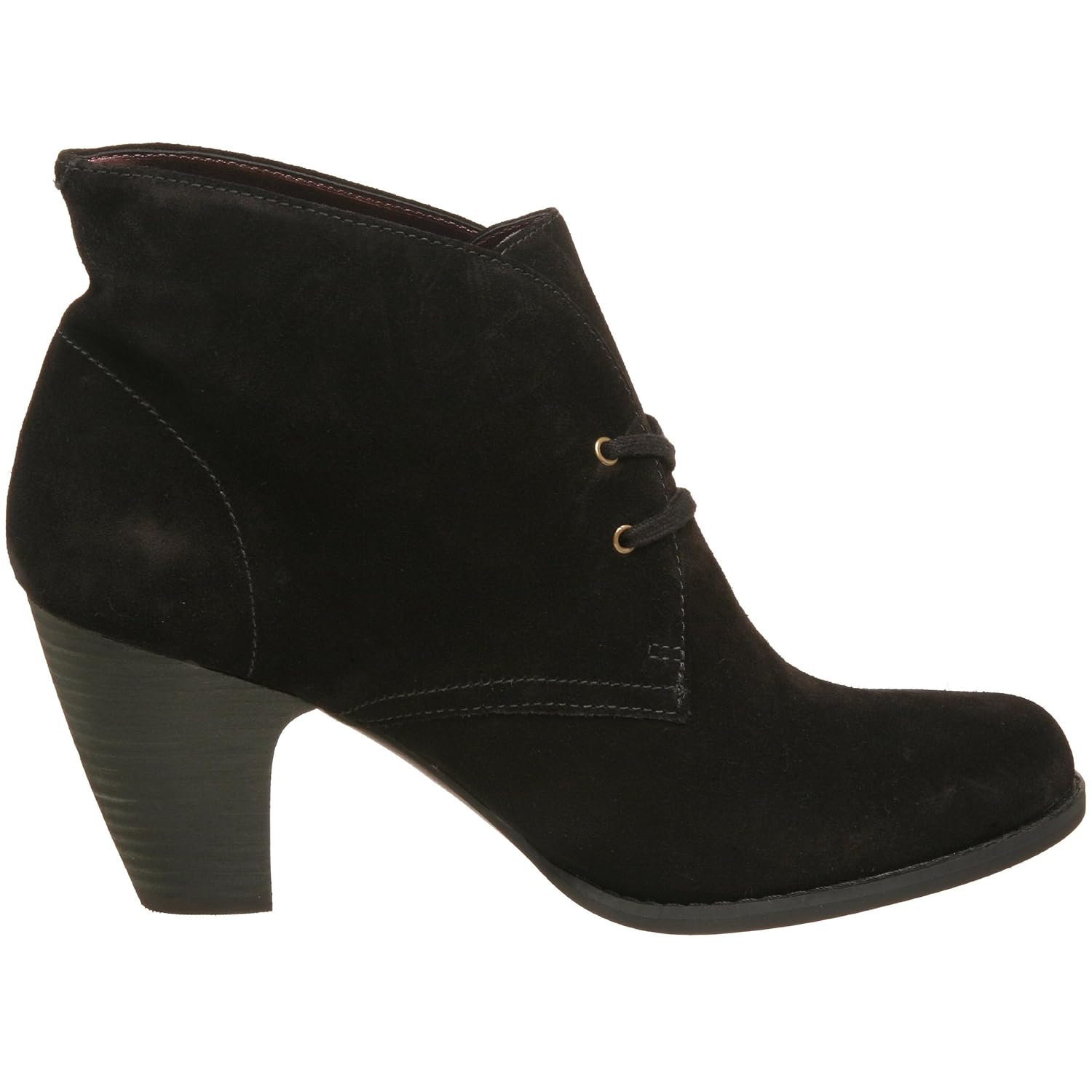
Since I was a kid my dad had a collection of desert boots. I love them. I love the way they look. While searching for them I found these two variations of them. It is almost as though my fathers shoes had a son and a daughter.

Original Clark Desert Boots >>>

The "son" Fred Perry Suede Trainers >>>


The "daughter" Clark Women's Indigo Water Row Boots >>>

I am a big fan of mixing retro fashion with contemporary elements. I love how it is executed in these versions. They all have the same primary design but subtle differences in the soles and shapes make this a very interesting family to study. If I had the capital I would deffinatly add the Trainers to my collection.

Wednesday, January 26, 2011

Redesign Series >> My Logo ( Grd 3000)

My logo was the first project I did as in a design class. I worked very hard on it and I am still open to renovations to it.


These were my first round of final designs. I had a million more sketches but I settled on these to develop digitally and pursue. I wanted my logo to communicate something uplifting because of my passion for improvement. 

Those on the left were derived from my own handwriting. I quickly wrote the letters trying to capture my natural handwriting. Then i took that and refined it to come up with these variations. The idea was to capture myself in my logo organically. I stacked the A on the K for uplifting and the exchange of stacking for support and uplifting through collaboration.

Those on the right were my more clean, stable variation that i designed through playing with the forms of K and A. I loved this combination because it made the K and the A similar in form and when united they make an M which is cool since my full name is Kwame Amuleru-Marshall. I was stuck on having wings in my logo since the year before when I saw my friend Mario designing his logo for Intro. So designed some that used elements from my type design.


These were what I initially turned in for critique. I went crazy with extra graphic elements. I shed the wings since they made it look like an air force logo badge. I tried to turn it into an upward pointing arrow using shapes that had duality like the two letters. The top shape was designed after a crown and the lower was designed after a smiley face with the letters being the eyes sort of like one of the exaggerated expressions in anime which I am a big fan of. I wanted them to show positivity. I chose the darker blue because it is a royal color and and the lighter blue to communicate the sky. The fact that my favorite color is blue had nothing to do with it! I also like how the lighter color seems like a kind of water mark version of the darker blue. Like a hazy back drop since the A is behind the K.


This is the redesign. Much more simple and to the point with a small up arrow "pointing to the skys".


This is the most recent design. I knocked out the stem on the arrow to make it very flush and corporate. I brought in the space between the two strokes of the K and widened the space between the K and A to help show that it is two letters, rather than one giant fancy M. One thing I love about this logo is that it can be read even when made to be very small. It has a cool modern type feel to it that I made myself but even so, it is mostly rounded and intimidating. It's triangular shape is simple and memorable and it shows stability. It still points to the sky, just much more subtle. The colors are cool and relaxed my I am most of the time but still represent royalty and the sky. 

-Kwame Amuleru


Monday, January 24, 2011

The New Direction of Identity - 3200 HW

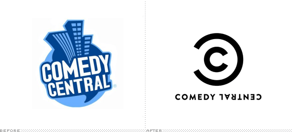
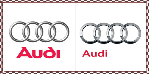
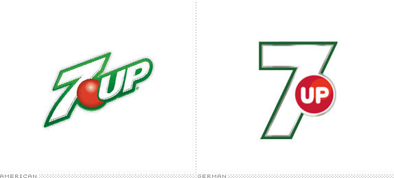
I noticed that a lot of logos and identities for well known companies are changing from a more free design to a more simple futuristic and sometimes chrome like or minimalist design. The examples I'll use to display this is 7up, Comedy Central and Audi.


The old comedy central logo has three colors and cartoon like buildings with warped type. They dramtically simplified their logo to a much more simple, minimal and a subtle clever upside down element to communicate comedy.
Audi made some very subtle changes but the font has changed to become less illustrated and smaller and left justified. It reminds me of the trend of one word sentences. For example "Verizon. IPhone. It Begins." The rings have become more shiny like chrome. A new trend of more flat and contrasted gradients.

Seven Up changed from a more free late 90's "cool" look to a much more standard simple version of a 7 and the up was moved into the red circle which has also undergone the more contrasted flat gradient look. Lastly the border was thinned out to become more subtle and the green was darkened. It seems more stable and less fleeting.

The general movement seems to be to become more solid and minimal with some trending visual aesthetics. I like the trend but I feel as though it will become old and unoriginal very soon.

- Kwame Amuleru

List of Businesses that I might attempt to Re-brand- 3200 HW

1> Silver Delight All Natural Caribbean Restaurant

This is a place in my neighborhood that has good food that takes me back to the Caribbean where I went to high school. I would love to dive into my c'bean heritage for design inspiration.
2> 2 6 Productions

This is a small production company of two black women who are directors here in Atlanta. One of them just so happens to be my sister! Movies are a big past time in my family and it is an industry I might like to work in. I would enjoy being able to come up with something fresh for a production company. Especially if it can assist my older sister with her endeavor.

3> Atlanta's Best Karate

This is a business run by a very decorated martial artist here in Atlanta. All my life I have been interested in martial arts and would love to research the visual communication of the industry in order to promote this business.

4> Poor Little Rich Girl Vintage Clothing Store

This is another small business run in my neighborhood with a great selection of vintage clothes for a great price. I'd love to see this business grow. I am also interested in fashion and I personally enjoy the vintage look. There is so much to research in this field and I love the name of the business.
5> Dragon's Horde Comic Book and Collectibles

This is one of the very few comic book stores in Atlanta. I also have am a big fan of comics, super heroes, anime, hobbiest games and all of the great art they include. I think this is a field where one could get really creative with the visuals for a business that serves all these industries together.


All in all I have a very hard decision. I love all these places and they are all in need of some visual revamping. Any advice?

-Kwame Amuleru