Monday, January 24, 2011

5 Best Logos - 3200 HW

This is a list of logos that I personally enjoy and admire for various reasons.

1 > Netflix


I love how so much is communicated in this simple design of the name of the company. Everything from the font, to the black emboss effect to the subtle arc at the bottom of the word to the colors and the rectangular background box. It quietly exudes the feeling of the movies. It reminds me of a modern rendition of old movie theater visuals but yet so clear and so simple.

2 > Coca-Cola Bottle Logo


More so than just the clean up to date representation of this variation of cokes logo, I love how usable it is in the application of various advertisements and motion graphics. The two flat colors are so well done and recognizable and somehow they have found a way to make a person desire a drink with only two colors. No ice, or water pigments, no gradients, just flat simple iconic shapes of the bottle and the inclusion of bubbles.

3 > Firefox/Thunderbird


I love how these two logos compliment each other in the use of these elemental animals that interact with the image of the globe and an envelope. They are well rendered and work great as computer icons. They both are round and clearly display what this service and software does. Thunderbird sends mail in the air to locations and protects them...fast. Firefox travels the world to retrieve information for you...fast. They way they both absorb and dominate their subject matter visually was just well done.

4 > World Wildlife Fund

A very popular logo. Two colors, sometimes just one. Flat yet implied dimension. Very minimal but still a very well rendered panda. The font width matches the panda width. Somehow the panda is a great representation of animals, still made to be cute even though minimal which makes people empathetic for the cause and it is an endangered species that is a good example of why this fund is necessary. Genius. A lot of valuable information in a very simple form.

5 > Lupe Fiasco's Logo


I might be biased with this one because this is the logo of my favorite rapper. However it is still a very good one. He is an american Muslim so he has his named written in English in a font that looks like it is Arabic. At first glance one assumes they cant read it but after further inspection it is obviously "Lupe Fiasco". I love the way the circular border is included in the font design. It also has a hip hop feel because it is reminiscent of graffiti. Being a big fan, I think this logo represents him, his trade as a rapper and his content in a clever aesthetically pleasing way.

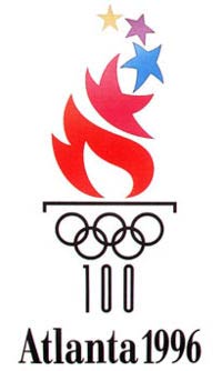
Bonus > 1996 Olympic Logo


I like how the flame is designed to incorporate the stars and various colors and how the rings and type create the column of the torch. Very good turn out for such a simple vertical assemble of the elements.


I am obviously a fan of logos that communicate in a clever and simple way, a great deal of information about the company or organisation it represents. I like them to subtly show the soul of the content it represents. 

- Kwame Amuleru

5 Worst Logos- 3200 HW

I'm sure there are logos I like less in the world but I compiled a few that I have had issues with in the past.

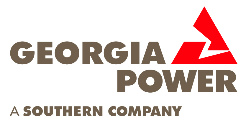
1> Georgia Power

My problem is with the graphic. I never knew what it was. Is it an awkward lightning bolt or an angular foot? What does it have to do with Georgia? Is it a backwards G maybe? If so its not a very good one in my opinion. I think it should be updated to communicate dependability of keeping Georgians with electricity. Maybe even include an indication of becoming more green for the future. But alas, not in this southern state I call home.

2> General Electric
It was a good logo for its time and it has lasted a very long time but I think its just outdated. No one in corporate uses that kind of font anymore. It looks very circa 50s to me. I think the company is well known enough for an acceptable change of font. Something modern for a new age of energy development.

3> Little Caesers


Once again, out of date. I think the font still works but the character and his border seem very 90s. He looks like clip art. Like a franchise that was branded by Joe Schmo Designs Co. down the street. It's time to render the character better and do something more creative with the border besides that thin black line.

4> AIGA


I might be getting ahead of myself as a designer in training challenging Paul Rands own handy work and the logo of one of the most important design organizations in the country if not world but I am. My issue with it is, once again, the font. It would be a good logo for a corporate company that does something no one is really interested in until they need it but as the image that represents the best and most creative of graphic arts, it is way too conservative. Also the logo does nothing to help communicate what the letters stand for. I find it hard to remember because they are all exactly the same. Maybe some contrast or doing something more creative with the letters would do wonders for showing the masses of creativity the org. represents. I am a fan of how the branding makes use of the solid perfect square though. My only gripe is with the boring letters.

5 > Life's Good


Once again, a common issue of mine. I don't know what the logo is. I see the L and the G very clear but that might be a little redundant with the LG text right next to it. One or the other is unnecessary. I think it might be an abstracted smiley face or just a mouth-less face. Either way, its doesn't do a good job of exposing that or making me feel that life is good. In fact I don't get much of anything from this logo. And the dot in the circle is memorable I must admit but for years I wondered why it was there rather than receiving some information about the company from it. Or any purpose to it at all besides a feeble attempt at an unrecognizable face.

All of these logos are of a certain standard. They are all known all over the country and have stood the test of time. However I would like to see them improve, update and become amazing. 

-Kwame Amuleru

Sunday, January 23, 2011

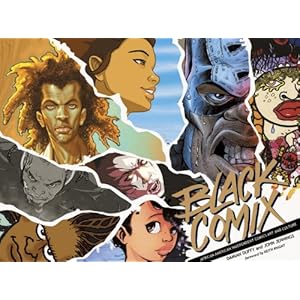
Black Comix: African American Independent Comics, Art and Culture

This book is on my wishlist! I wanted to share it though. I saw it at Barnes and Noble and encourage people to check it out if they are there. It displays independent comic book creators of the African American variety. This is an area I'm interested in and would love to see it grow. One day when I save up 30+ bucks I'll pick this book up and display it on my coffee table!

                                                                                                                     Check it out >>>

Pentagram

Another website with a great portfolio. This is a design consulting firm that has a lot of pieces to display, some of which you probably recognize. They provide in depth creative briefs with the pieces. Once again, good to learn from and gain inspiration from.


                                                                           Check it out >>>

*Random Idea* : Animated Grid

I was looking at various websites and see that most of them are organized in various boxes of information arranged through out the screen. I wondered why? What would happen if we got rid of these boxes. Then I decided that they are probably products of grids and if we got rid of the grids then we would have chaos, the opposite of information design. So then I thought, what if organization was implied by motion rather than boxes, borders and implied lines. What if someone coded an application that allowed designers to create and work with grids that move and thus change live on screen or maybe partial movement. I would imagine the information would look chaotic at first but much like a school of fish or a flock of birds, elements of design and organization could be instilled by motion. Different directions, speeds and patterns could be used to separate one set of information from another. Something I might one day like to experiment with when I get the resources or knowledge to do so.

-Kwame Amuleru

Hagopian Ink

I was reading a forum entry about what to expect in a design career fresh out of college and it had a number of interesting links. I came across a website for a one woman design company in New York City that has won awards. I just wanted to share the website. It in itself was designed well and I found the ink animations to be an interesting backdrop. I'm wondering what about it makes it not too distracting because I was able to easily focus on the text on each page while it played in the background.

Most interesting about the site of course is the work that is posted. A lot of her work are from recognizable businesses. The cool part is that she includes in the details tab, the need and her solution for each displayed piece which is very helpful in understanding and learning from her work as a designer in training.


-Kwame Amuleru

Wednesday, November 10, 2010