
The old comedy central logo has three colors and cartoon like buildings with warped type. They dramtically simplified their logo to a much more simple, minimal and a subtle clever upside down element to communicate comedy.
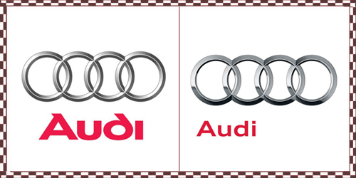
Audi made some very subtle changes but the font has changed to become less illustrated and smaller and left justified. It reminds me of the trend of one word sentences. For example "Verizon. IPhone. It Begins." The rings have become more shiny like chrome. A new trend of more flat and contrasted gradients.
Seven Up changed from a more free late 90's "cool" look to a much more standard simple version of a 7 and the up was moved into the red circle which has also undergone the more contrasted flat gradient look. Lastly the border was thinned out to become more subtle and the green was darkened. It seems more stable and less fleeting.
The general movement seems to be to become more solid and minimal with some trending visual aesthetics. I like the trend but I feel as though it will become old and unoriginal very soon.
- Kwame Amuleru
No comments:
Post a Comment